
Small Business Web Designs Adelaide Clients Had Built.
Every small business website designed by Thinking IT is customised to meet the needs of the client. Every small business is different. The range of services they offer can be different, so can the range of products if the business is a ‘bricks and mortar’ retail business. The expertise and experience will also be different to other competing businesses servicing the same group of customers.
It’s important therefore to showcase the core services or product categories that differentiate you from your competitors, the points of difference that customers should be aware of.
Finding out what these unique aspects are for your business will help plan what the web design will look like.
Good small business web designs Adelaide clients of Thinking IT receive is built with a purpose in mind, not just to look great. Setting up funnels that direct visitors to specific pages, setting up areas with content you’d like all potential customers to see and including ‘call to action’ sections are all part of creating a good ‘User Interface’ (UI) and ‘User Experience’ (UX) website design.
As mentioned above, all websites are customised, so they will naturally look different to other sites on the web, however there are some features that are included in locations that will be the same.
The following list illustrates what aspects all Adelaide small business web designs have included on their website.
Header Section
Business Logo
Best located in the top left corner of a website, the logo is a visual, graphic image that represents your business. Logos should be clear and are typically horizontally rectangular. It’s good practice to use two transparent ‘.png’ format images, one twice the size of the other, to cater for Apple’s ‘Retina’.
Typically too, the colours used in the logo form the basis of the colour scheme for the website.
Slogan
Many small businesses don’t, but should have a slogan that becomes synonymous with the businesses name. This is located in the top right area of the ‘Header’ section of a website, so it falls underneath the logo when viewed on small screen Smartphones.
Navigation Menu (Primary)
To make it easy for visitors to navigate around different parts and important pages of your website, a primary menu is added. Depending on the number of pages, product categories or blog categories you require, a secondary menu may also be added, after the page content towards the bottom of the page.
Banner / Feature Page Image
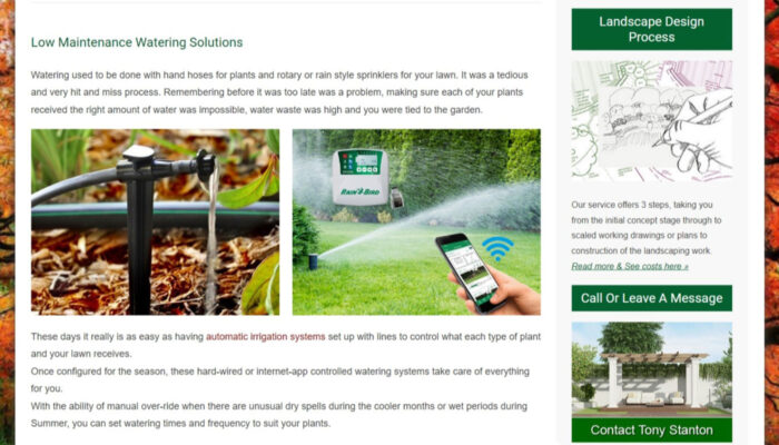
Image banners add colour and interest to a page. ‘Home Pages’ and full width pages can have images that span the full width of the screen (2k or 2048px wide are best). Inner pages or articles that are setup with a ‘content/sidebar layout’ have a feature image below the page title.
If you’re not confident, or have tried to take photos yourself on a camera phone that have turned out less than ideal, Thinking IT offers a photography service and a graphic design service you can take advantage of.
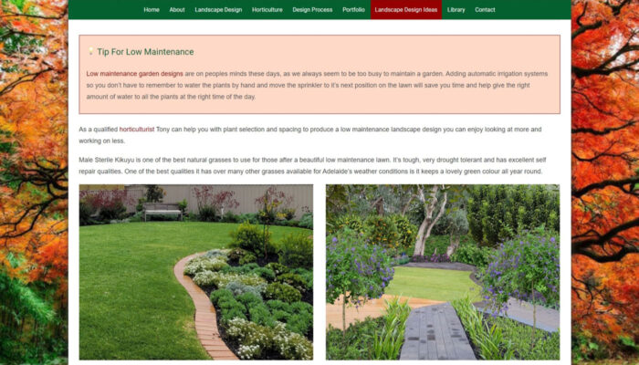
Here are 2 examples of header sections used with great effect.

Sporting a stylish logo, the slogan lets visitors know exactly what the site is about.
Simple navigation, relevant full width banner image & ‘Welcome’ message make for the perfect ‘text-book’ header section which lifts off the page with an attractive background that sticks as the visitor scrolls down.

Breaking away from convention, instead of a slogan, a graphic invites users to a ‘Free Quotes’ page containing a list of suburbs serviced by these landscapers.
A ‘Breaking News’ scrolling section above the logo (client supplied) lets visitors know what the latest content in the blog is.
Page Content Section
Page Heading
The page’s title is a SEO signal, so careful consideration should be given to the words used. Relevance to the content, what the page is about, is important, so don’t follow those ‘click bait’ titles often used on news websites to grab attention but have little to no bearing on what the story is about.

Page Layout
Pages can be ‘full width’ spanning the entire width of the website, or can include a ‘sidebar’, typically located on the right hand side of the page.
Ultimately this will depend on whether a page is significant and worthy of not being distracted by other content. Often pages that appear in the main or primary menu are core pages and have a full width layout, as opposed to articles that appear in a ‘blog’ that provides interesting or educational reading that’s linked to a core subject.
(Full Page Width Content)
(Content / Sidebar Layout)
Page Content
For those where SEO is an important consideration (it should be for all small business web designs Adelaide clients have built), ‘Content Is King’.
A pages ‘Main Content’ (MC) is one of the most important ranking signals, the Google Algorithm looks at when deciding where a page appears in search engine results pages (SERPs), so the words and user experience (UX design) should be worthy of taking quality time, not rushing.
Copywriting is a skill, and an important one to the success of any local SEO efforts. There are many rules and guidelines to consider when handling ‘keywords’ both from a density and frequency perspective, so it’s best that professional copywriters with years of proven success, like Nigel Brookson has are used to write all the content.
Author Attribution
Copywriters are ‘ghost writers’ and the best ones don’t take credit for the work they do, instead the Adelaide small business owner is the one attributed with the content.
This section often has a photograph and brief write up of experiences and skill set.
Google’s Search Quality Guidelines spell out (Section 3.2) the importance of Expertise, Authoritativeness, and Trustworthiness (E-A-T).
- The expertise of the creator of the MC
- The authoritativeness of the creator of the MC, the MC itself, and the website
- The trustworthiness of the creator of the MC, the MC itself, and the website
Footer Section
3 Column Layout
I personally like a 3 column layout, at least. All small business websites built for Adelaide clients are ‘dynamic’. This means they can be coded to include pieces of content that constantly changes every month when new articles for the blog are added. This keeps the pages and website fresh with new material for visitors and search engines to read.
- The first column I dedicate to a summary of the businesses core services. It’s an abridged version of the ‘About’ page
- The second column can include the latest article posted with an image, or a list of the latest 10 articles
- Lastly, the third column contains the business logo plus contact details including address and phone numbers
Here are 2 examples of footer sections that appear on every page.
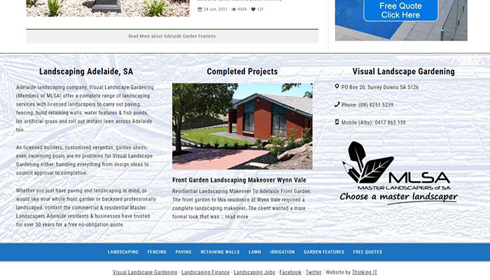
(Text Book Footer)
(Alternative Footer Section)
After A New Website Design That Ranks?
Whether you’re looking at upgrading or starting from scratch, provide services or have products you’d like to sell online, Thinking IT can design and develop a stunning UX website for your business and make sure it ranks at the top of all search engine result pages (SERP).
After discussing your goals and analysing what you require, Nigel will be able to let you know exactly what the costs will be to meet your unique needs.
At Thinking IT, we can handle everything to make your online presence a success. From photography & graphic design services to copywriting your pages & website’s blog, set up automated email campaigns & look after your social media or PPC marketing.

